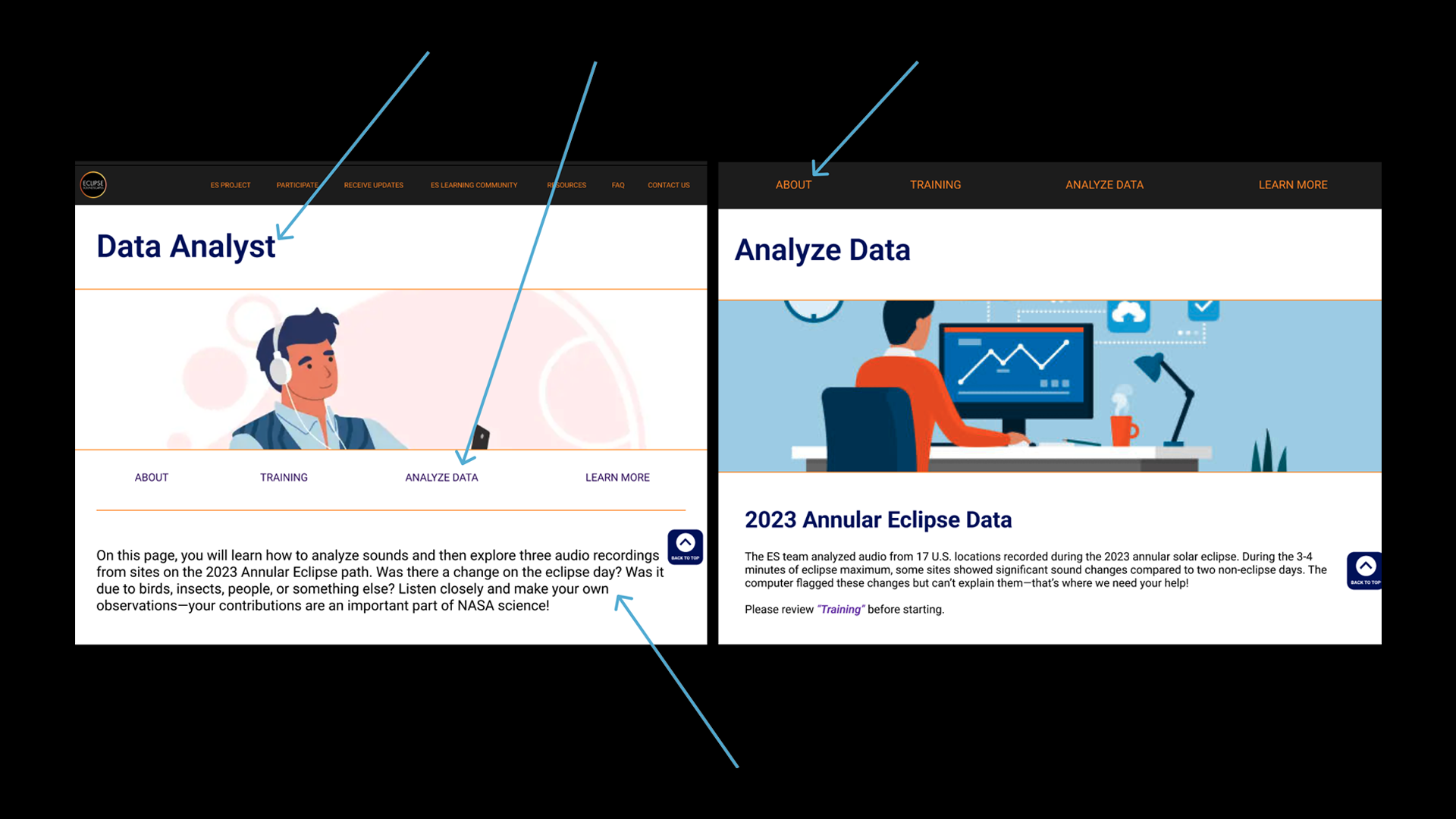
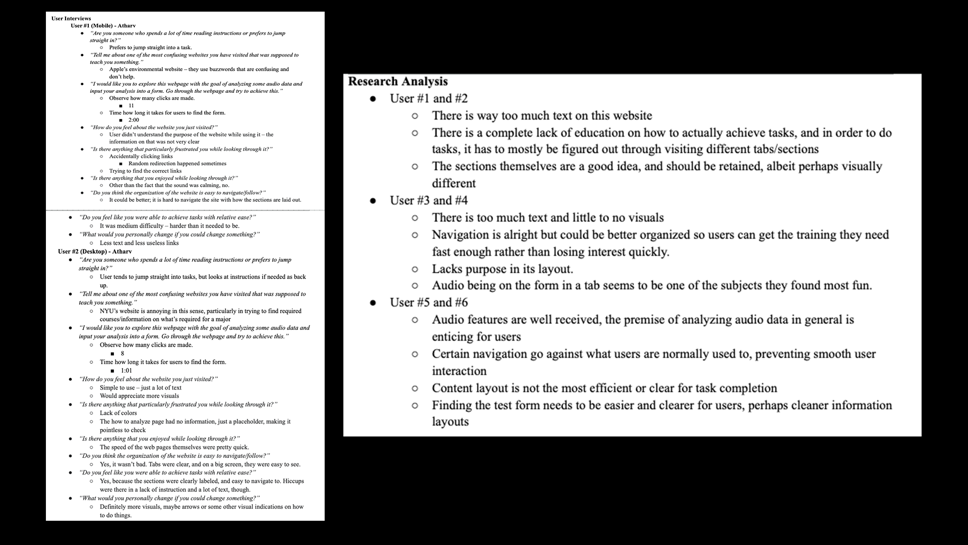
To first understand what exactly is wrong with the current product, we conducted user interviews and subsequent usability testing on the current website. We then took this information and analyzed and made conclusions based off it. This allowed us not only to get direct feedback from users on what worked and did not work as well as understand how effective the website's layout was for creating effective solutions.
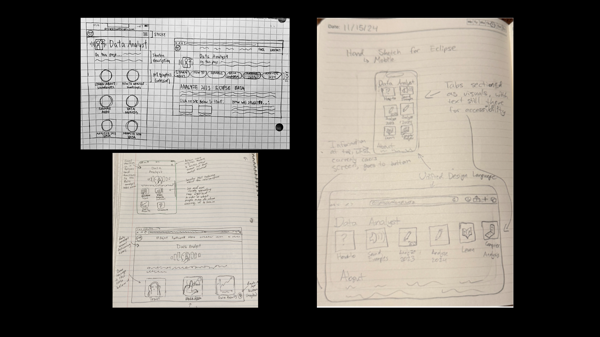
We understood that organization and understanding how to do tasks was a bit of a challenge. As we first began ideating how we would solve the problem, we initially thought we would make a new visual nav-page. These are some mockups of those early designs.
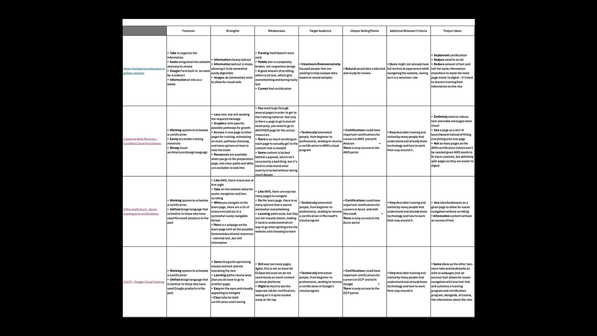
For our competitor analysis, we looked at three other sites that trained users. These sites were Amazon Web Services' course training page, Microsoft Azure's course training page, and Google Cloud Program's course training page. These are all very popular sites for training in a specific discipline, so it acts as a good comparison point.
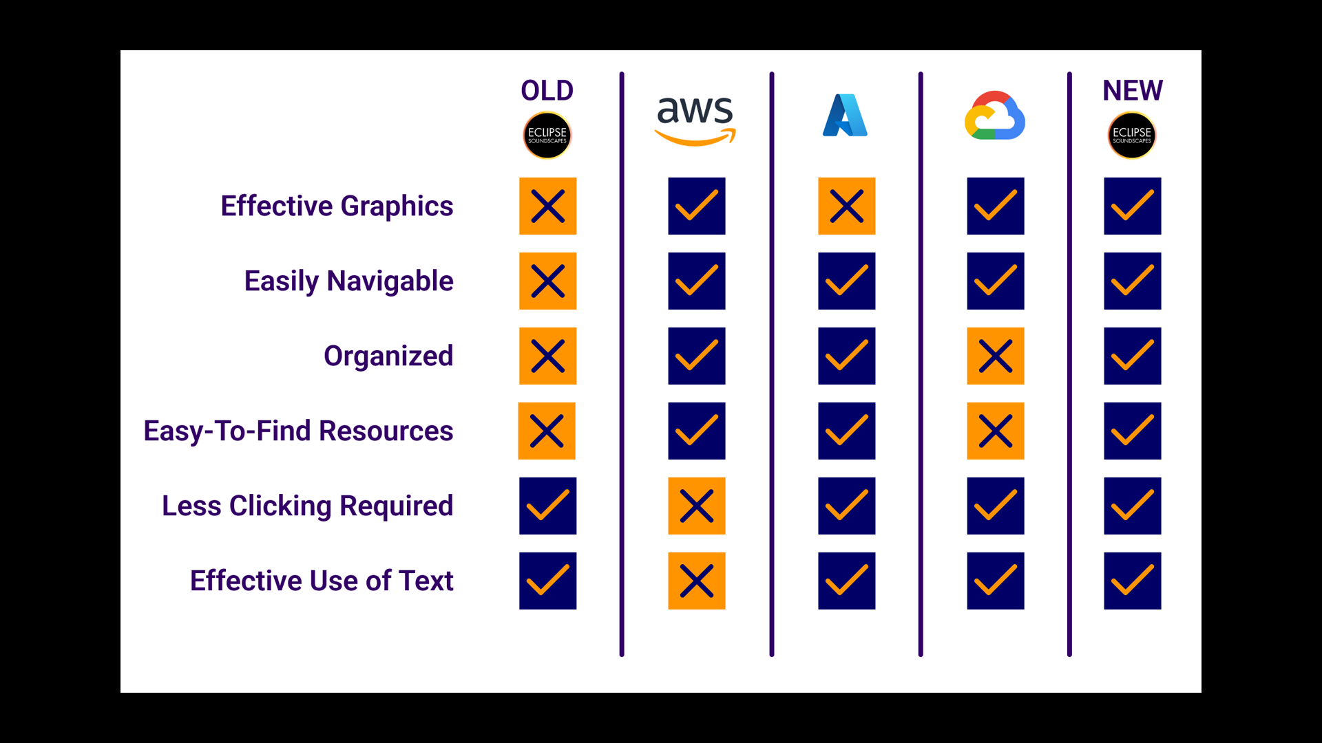
After looking through our competitor analysis, and factoring in all the features we planned, we synthesized our findings in the adjacent graphic. We used this when we ultimately presented my app, which is why it reflects the features of the final product as well. (I'll get to this soon!)
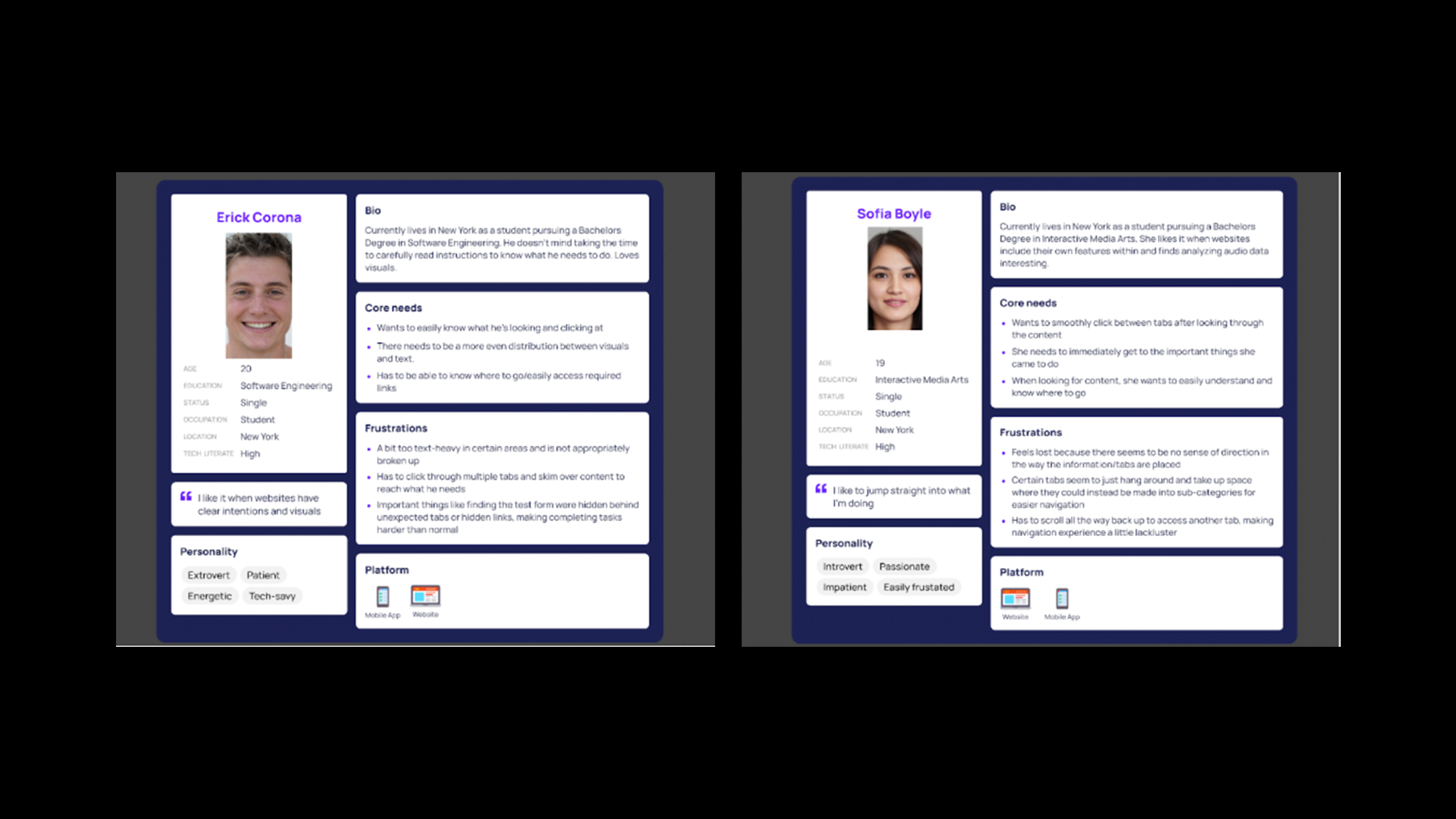
We had a possible solution: build a nav page. However, we wanted to understand - was this really what people wanted? We hadn't tested this concept or done proper research into user solutions. So we did further research. We also, as seen in the adjacent image, created personas to reflect our users.
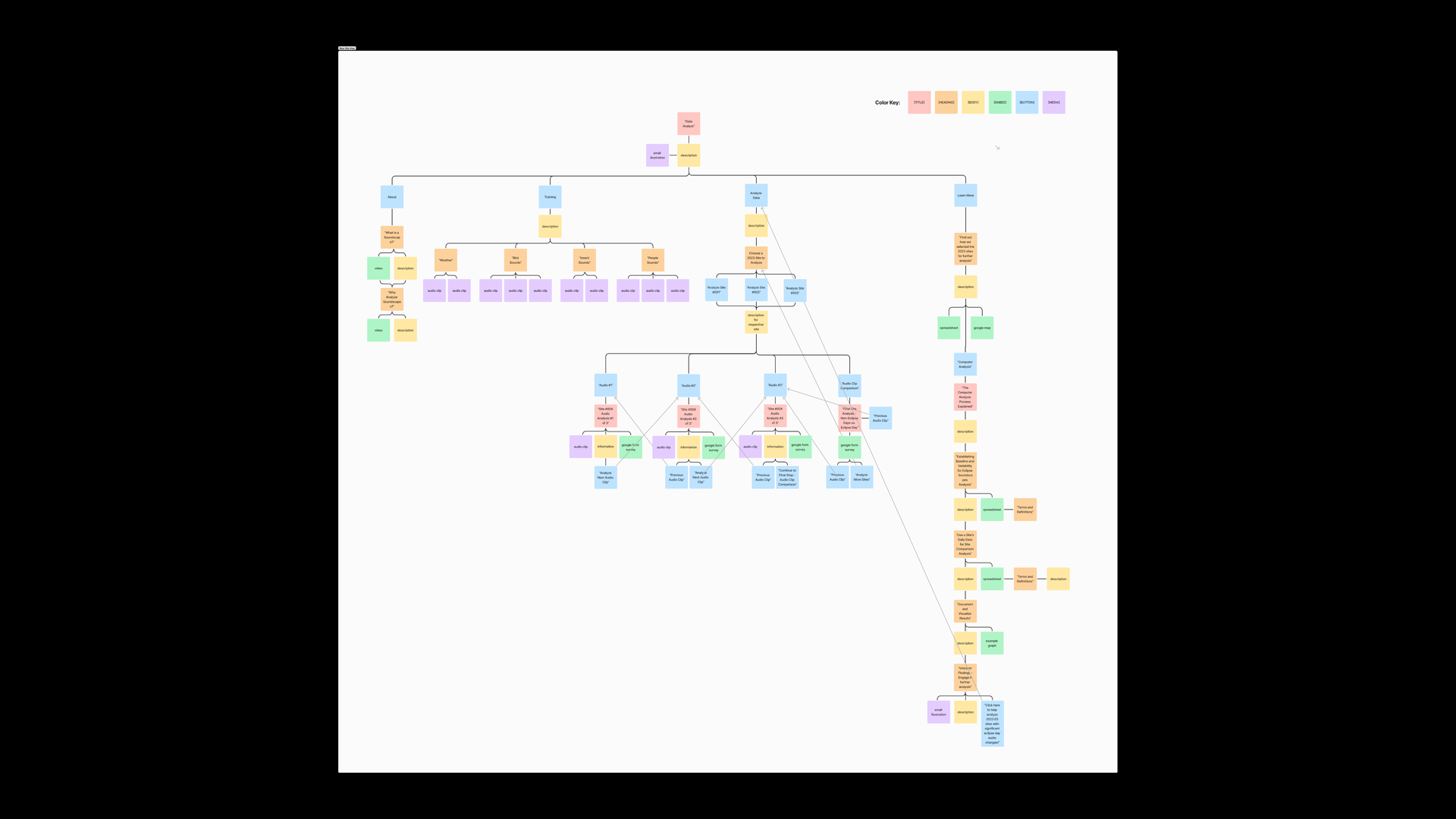
We also wanted to try another research method: card sorting. This would allow us to further understand how people saw the organization of the website purely based on the different items on every page. But in order to more easily set up the card sorting system, we created a comprehensive sitemap for the entire page, which you can see in the adjacent image.
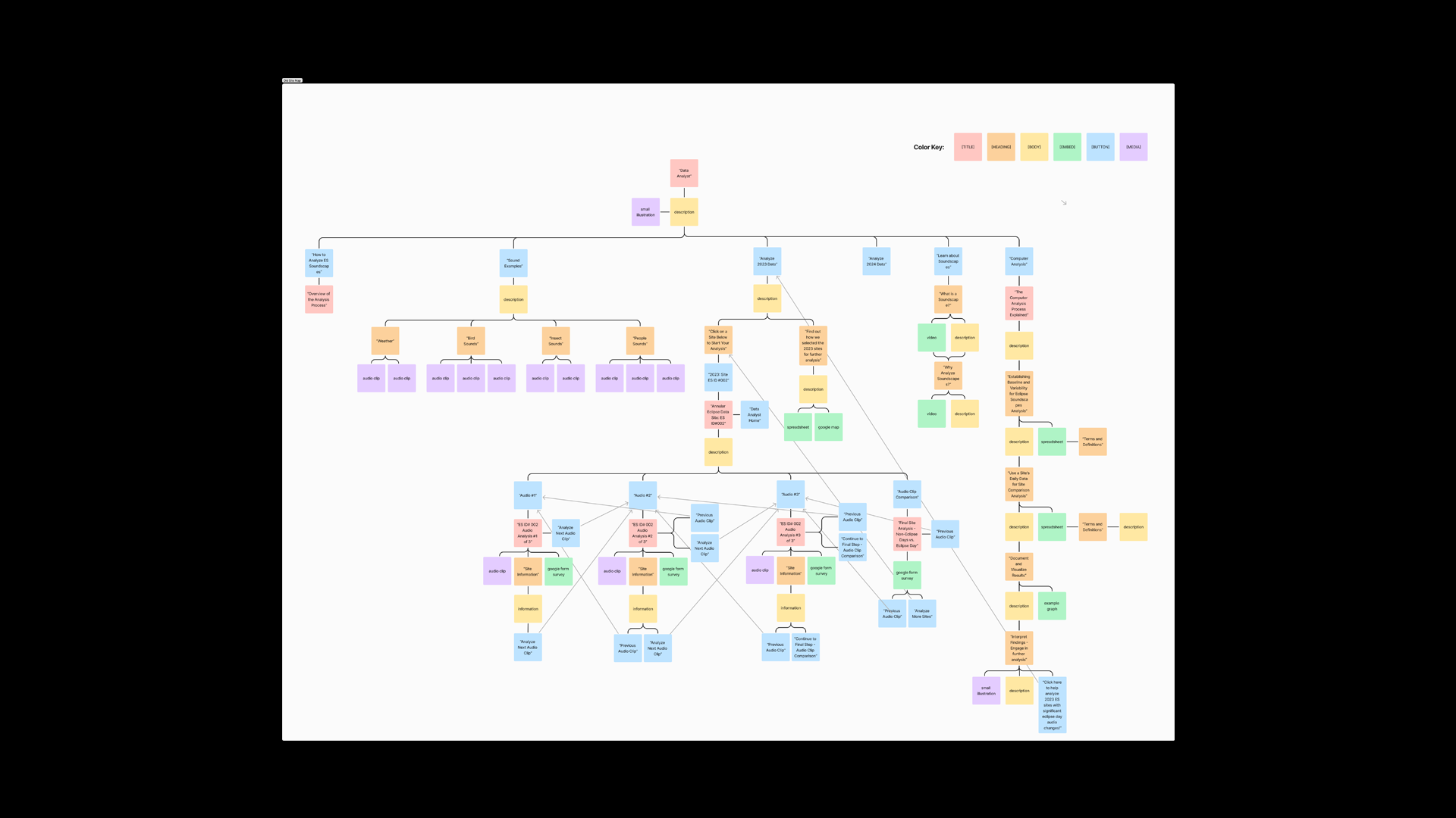
Based on the (rather convoluted) site map, we created cards and had users sort them and, crucially, create their own categories based on what they thought made sense. In our results, we noticed users only sorting cards into four categories, indicating that the current site had far too many pages and that this was the core issue with the page.
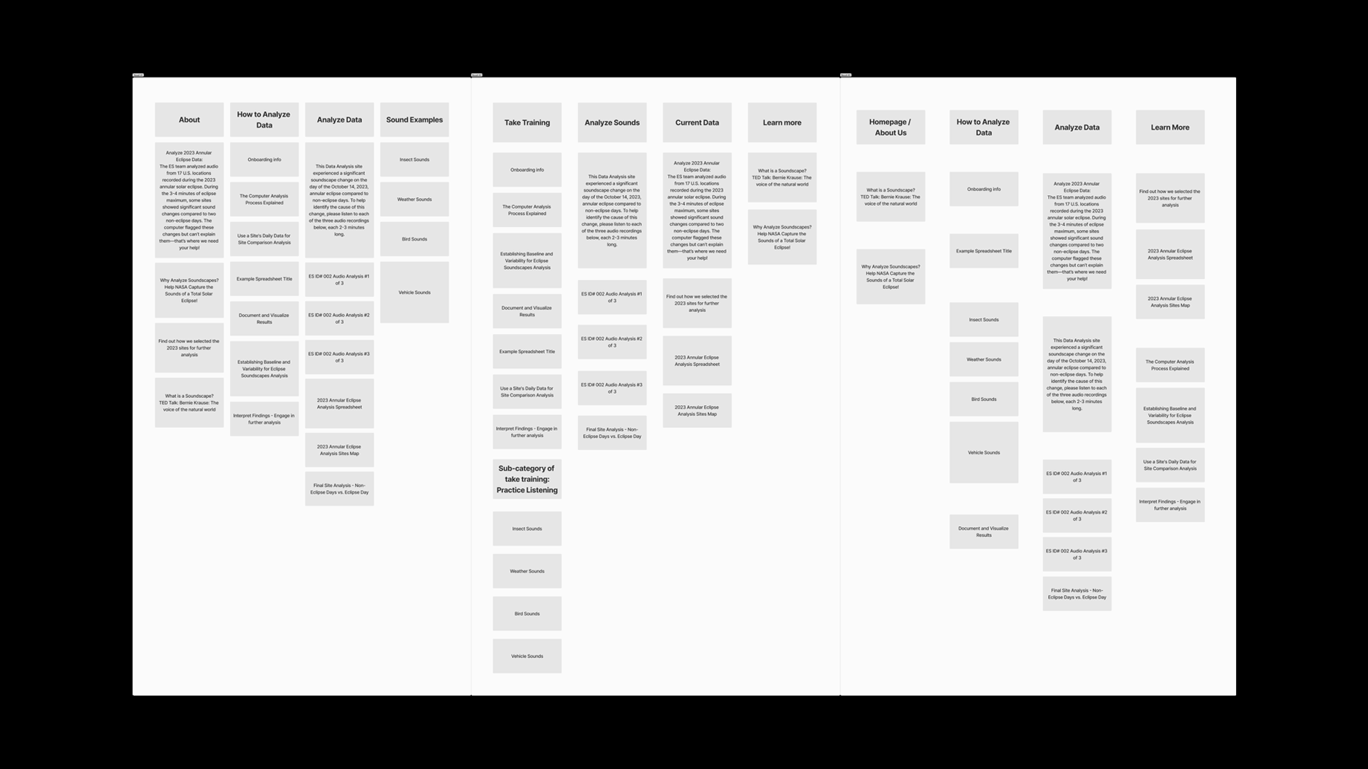
We used the card sorting activity and took the common ideas from it. We then, based on this, created new tabs and created a new sitemap that was more organized and easier to use. Moreover, we chose to go with an infinite scroll system to not only enhance accessibility for VoiceOver and general screenreader users, but also to allow people training in the data analyst role to see the training and eventual work as a journey.
For this project, we made sure to follow accessibility guidelines to make sure that the website would remain inclusive for everyone. As I've already mentioned, the nature of an infinite scroll makes it accessible in terms of using a screenreader. However, we also made sure to follow legibility and readability guidelines to keep everything easy to consume and use.