
Film Studio Logo
Home About Films Contact
Atharv Gopaluni
About Portfolio Still Images Socials/Resume Contact
Poliframe: A UX Design Journey

In my fall semester of my sophomore year of university, I took a UX design course. One of our projects was to design a product that would solve a political issue. I chose to try to help solve the issue of a lack of clear education on bias in the media. To do this, I had to conduct user interviews, usability testing, and competitor analysis. I ultimately created a final design and did well on the project. Review my journey below!


Step 1
What's the problem?
People of various different political standings lack proper education and good resource(s) to examine various perspectives and reexamine their own among growing bias in social media and TV media.
My proposal was that I would create an app that would act as a launchpad that shows news of various different political views. I want a constantly updating digest, based on political view and likes and dislikes which users can put on articles, and I want to make sure there is the ability to clearly see which way an article leans. Plus, an education tab to learn more about bias in media and social media would be very nice.


Step 2
So...I think it's a problem. And I think I have a solution. But what about everyone else?

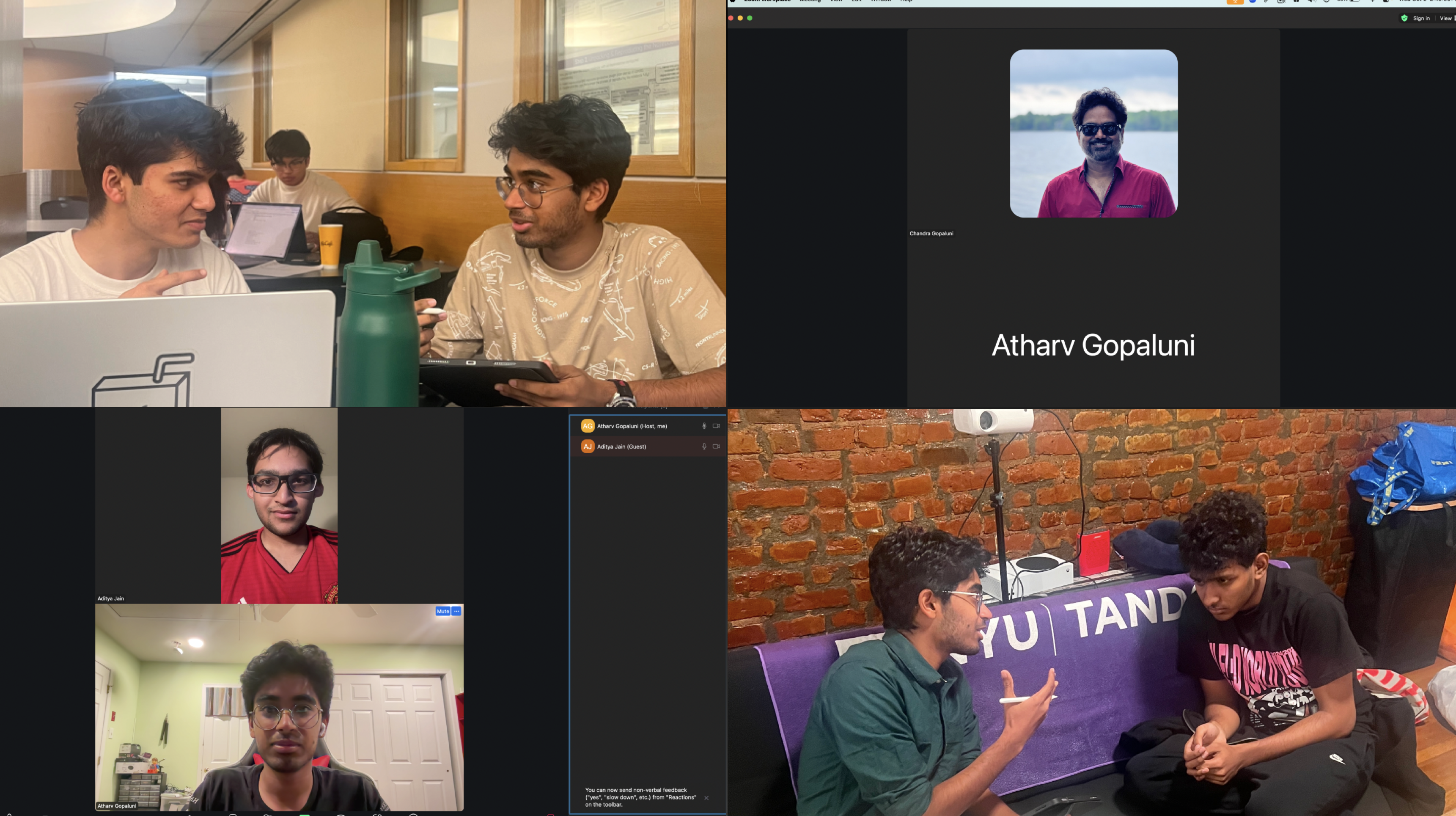
To learn more about whether the product would be useful, I conducted qualitative interviews with my friends and family to understand if they would even use a product like this. I made sure to include people of various different political backgrounds and socioeconomic backgrounds to understand how different people would see the idea of the product.
Presentation Posters

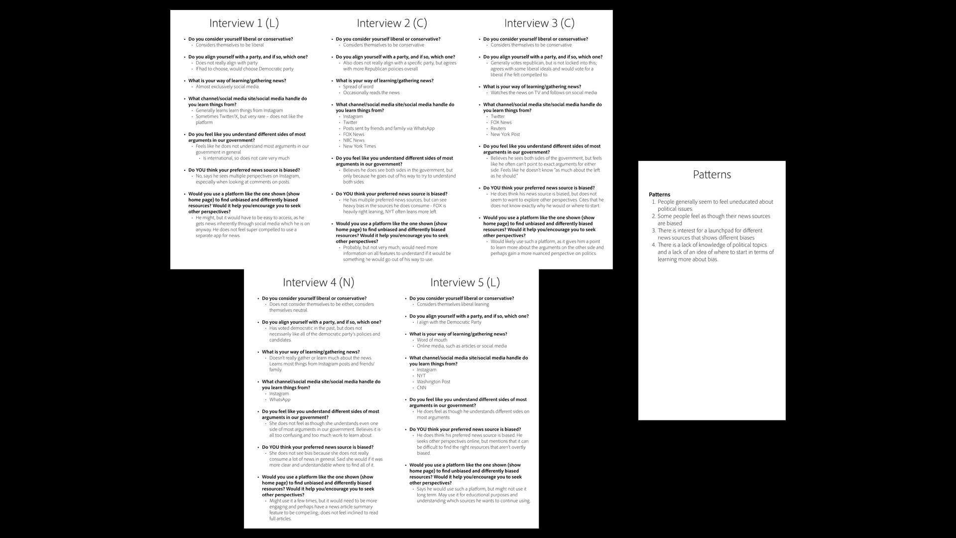
I analyzed all the interviews and made some inferences and conclusions based on their answers to my questions.
Second Presentation Posters

Step 3
Before I went all in, though, I wanted to see what was out there.

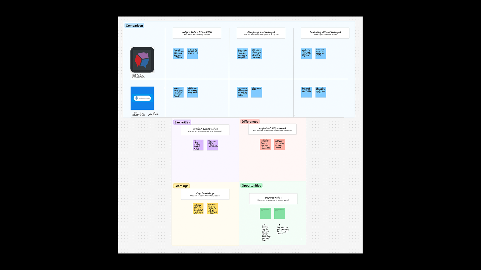
I checked out two major platforms that function as bias education and bias checkers. I used templates included with Figma to organize my findings and possible additions and opportunities for my app.
Presentation Posters

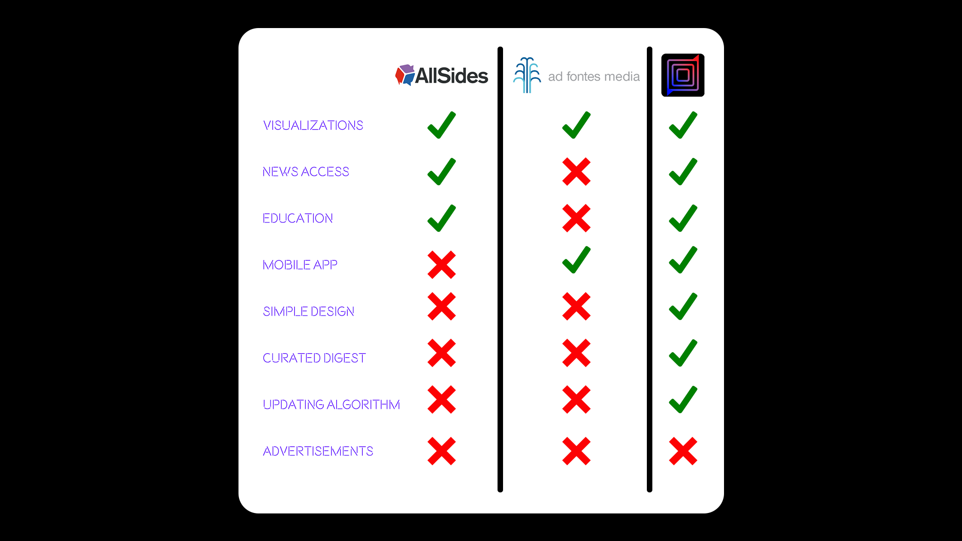
After looking through my competitor analysis, and factoring in all the features I planned for my app, I synthesized my findings in the adjacent graphic. I used this when I ultimately presented my app.
Second Presentation Posters

Step 4
Iterative Design

I didn’t just shove together a design either. I made prototypes beforehand. I then conducted usability testing. I timed people on their ability to navigate the app (using an early prototype mocked up in Figma). I timed their ability to achieve simple tasks on the app, these being finding the lean of a source, finding an educational source, and logging out. And I took their feedback and improved the app. The iterations I used are the images you can find on the rightmost side of the adjacent image.
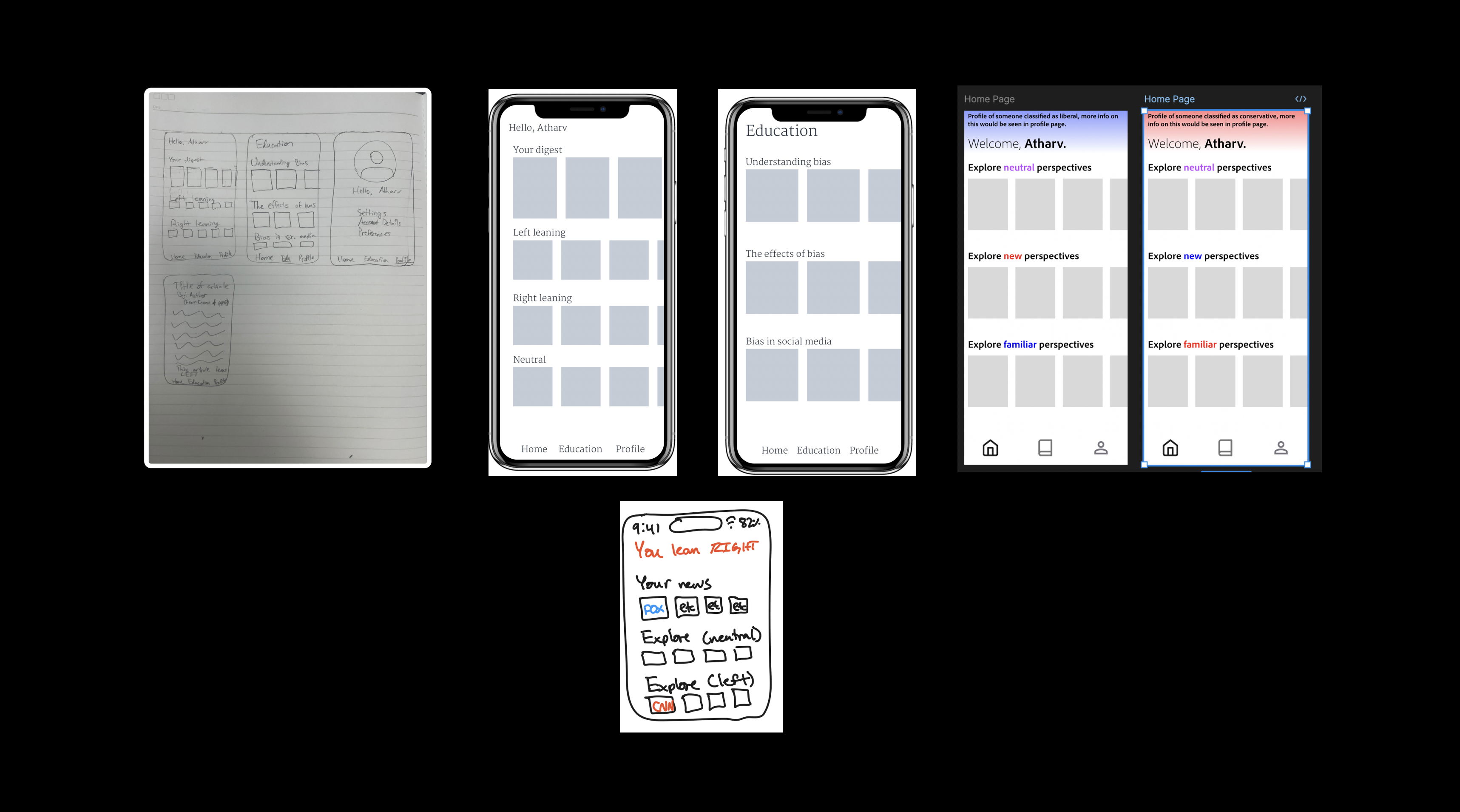
Presentation Posters

I conducted these tests and logged my results. I used these results to draw conclusions about additions and modifications I would need to make for my final iteration.
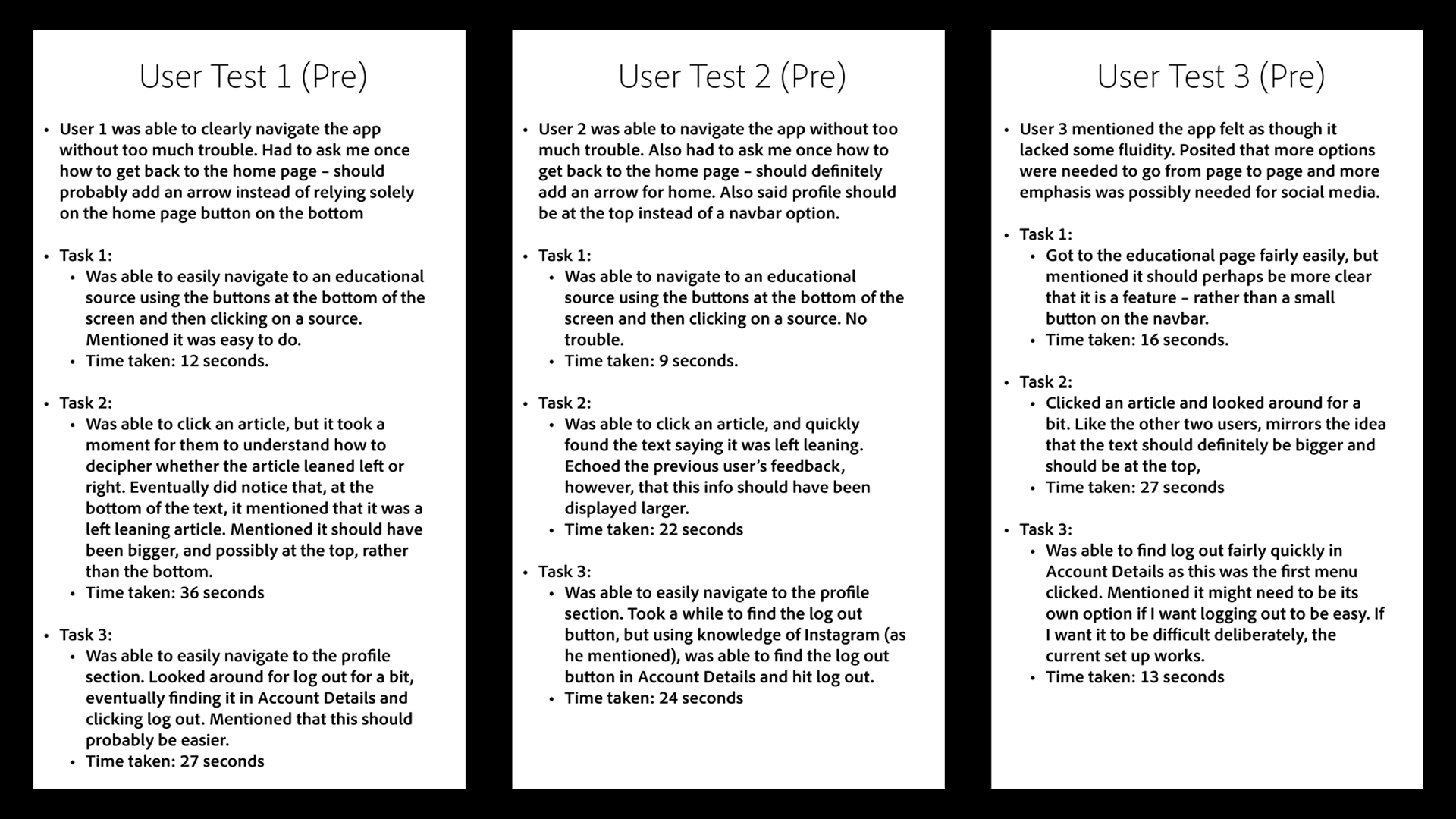
Second Presentation Posters

After creating my final prototype (which I'm about to show, I promise!), I conducted the same usability testing again, and got much better results. On the second run, I achieved an average 57% faster speed for task completion, indicating the efficacy of my iterative design.
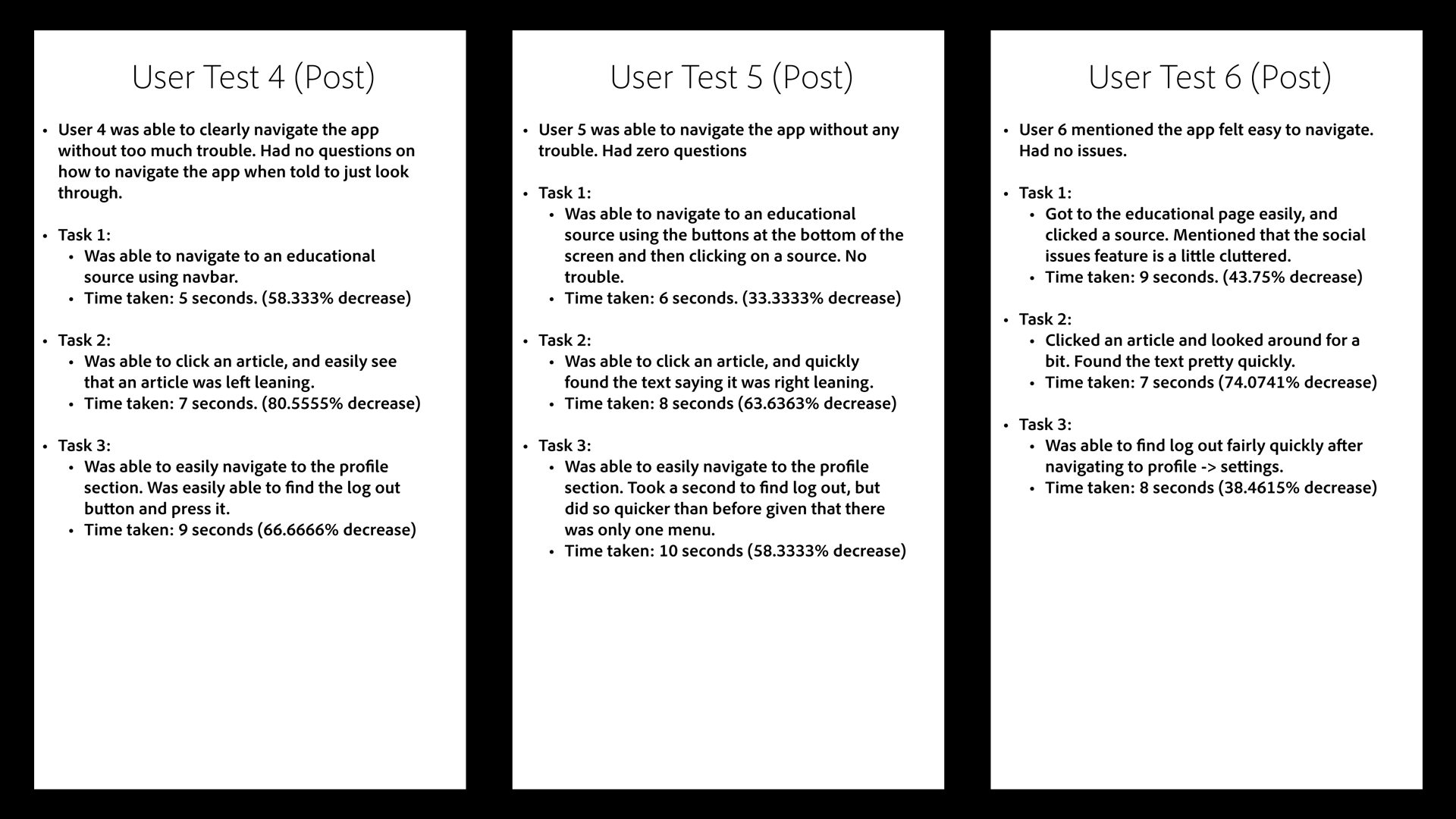
Presentation Posters

Final Result
And now, it's time!
Here's a quick "advertisement" I made in the style of an Apple commercial for my presentation. Under that, you can find a Figma embed of my prototype, followed by a viewable link for the project.

This project was very enlightening to me, and I got a great deal better at the UX design process, from research to prototyping. I have ultimately gotten experience in all these skills to take to future projects. You can find the link to the Figma prototype here.


× Enlarged view